(brief forward: this post is meant to be simply a study of the history of color film from 1939 – 1969. It is not intended to exclude or demean the importance of any color or black and white films not mentioned herein… and it is CERTAINLY not meant to imply the superiority of one process over the other.)
“Film color is not real. We accept it because we have to and because we’re used to it. The sky is not the blue that you see on film. And the green grass is not the green you see on film. I remember once in London stumbling across Michelangelo Antonioni shooting Blow-Up with Carlo Di Palma and they were painting the grass green. And I said to Antonioni, ‘Did you not like the color?’ He said, ‘No, I just want it to look like real green.” — Sidney Lumet, 2007.
I think it fairly safe to make the argument that the idea of a film like Citizen Kane being shot in color is just as outrageous as the idea of Oz being shot in black and white. The reasons being obvious: one would take away the reality of the film, while the other would take away the fantasy.
However, let’s move forward a few decades and kick around the idea of a film like Arthur Penn’s 1967 classic Bonnie and Clyde being shot in black and white. Now, that’s a devastating thought given Burnett Guffey’s lyrical cinematography that has become so much a part of what makes that film great… however, I do not believe that it being shot in black and white would necessarily have detracted from the gritty realism of the film. (Especially had it been in the hands of someone like James Wong Howe…) The reason being, by the late 1960s color film processing had made remarkably sophisticated advancements in technology. Perhaps more than any other film of that era, Bonne and Clyde demonstrates how deeply affecting the realistic rendering of color stock photography had become. A formidable challenge to what had, previously, been commonly accepted as realistic: black and white film.

When Bonnie and Clyde are ambushed by the feds in that final, shocking scene, the gratuitous blood was startlingly real to audiences who, up to then, had always known perfectly well that it was really just ketchup. Those images were as vivid as any page in the National Geographic, and it is quite fitting indeed that this revelation coincided with the revolution of the “New Holywood” era of filmmaking. The Hollywood studio system was dying and filmmakers were tackling subjects heretofore taboo– and they were doing it in color.
This moment had been subjugated for the better part of twenty years. Rewind, if you will, back to the late 1930s when three-strip Technicolor finally blossomed into its own, and you will find that the obvious argument for this black and white vs color vs reality vs fantasy lies in that powerful year of 1939, with Technicolor’s crowning achievements: The Wizard of Oz and Gone with the Wind.
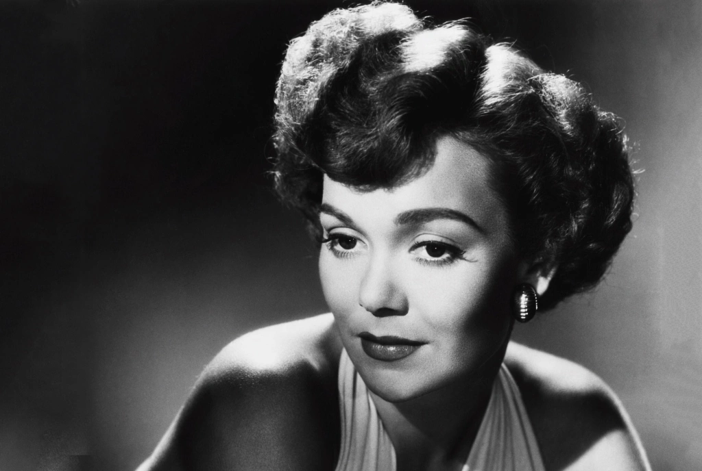
These two films, definitely among the most analyzed in film history, remain a curious anomaly to me. It may sound hyperbolic for me to say that Gone with the Wind, while a three strip Technicolor dream of a film, at the same time would be the last truly realistic color film to come from Hollywood until Technicolor’s dye-transfer process began its fatal fade in the late 1950s.
(I said Technicolor, mind you, so let’s keep CinemaScope out of this. A million posts could, and probably should, spring from this. My argument for this is, obviously, quite up for debate and, hardly being an expert on this history of color processes I would love feedback!)
The reason for Gone with the Wind’s realism is simple. Under David O. Selznick’s lead, cinematographer Ernest Haller employed lighting techniques used in black and white film: “Selznick also uses shadows to emphasize moments that focus on the relationship between characters in Gone with the Wind, first seen in the form of the looming shadows Scarlett and Melanie cast on the walls of the makeshift hospital. Later, the delivery of Melanie’s baby is lit only with slivers of light that appear between the window slats, the darkness making the scene more intimate and giving it a powerful simplicity.” (SparkNotesEditors)
The split screen below might better illustrate. Remember, both films were produced using the exact same Technicolor technology.

In the Dorothy shot you can easily see this is very much a 35mm film with its shallow focus– while Dorothy appears beautifully fresh and crisp, the background is reduced to a blur. In the Gone with the Wind shot, likewise, the foreground is of a pristine clarity but the clever use of a matte backdrop keeps the focus startlingly urgent and all encompassing. In many scenes, Gone with the Wind successfully “cheats” technology by giving the illusion of what cinematographer Gregg Toland would legendarily achieve two years later in Citizen Kane with his pioneering work in “deep focus” photography– the full frame being in clean, clear focus.
In the book Selznick’s Vision, Gone with the Wind and Hollywood, author Alan David Vertrees goes a step further. While I’m not exactly in total agreement, I can absolutely can see where he’s coming from on this one: “[With Gone with the Wind] we begin to peer into a movie, rather than perceive it in carefully arranged slices, with the camera flitting from speaker to speaker, and all feminine faces in soft focus … Gone with the Wind is the perfect instance of the new tone, more so than Citizen Kane, because its passions are large and simple, it is full of windswept silhouettes caught against reddening skies… it is overplayed, overwritten and it is just right.”
So why am I going on about two Technicolor marvels of the late 1930s when this post is about the New Hollywood of the 1960s?
Easy.
Gone with the Wind and The Wizard of Oz are emblematic of a fascinating moment in films history. Color technology, as so monumentally manifested in Gone with the Wind, was indeed capable of achieving surprisingly lifelike renderings. The Wizard of Oz, being a fantasy, emphasized reality with black and white (OK, fine. Sepia. Sticklers.) while color was used to create escapism at its eye-popping best. The fact they were both shot using the same technology, for me, is a fascinating dichotomy: it is the decisive moment that Hollywood would purposefully, from that point on, choose to employ black and white as a method of expressing realism, while employing color film as fantasy–for reasons both financial and sociological. Color was exponentially more expensive to produce and with America at war it was only natural to provide escapism on the grandest scale possible– made manifest in the vivid, deeply indulgent color extravaganzas of the 1940s. Carmen Miranda in black and white? Casablanca in color? I think not!
I’m going to muster up some courage here and make the claim that Gone with the Wind would remain the most deeply human, realistic 3-strip Technicolor film until well into the 1950s. With, of course, certain notable contenders like Drums along the Mohawk and The Life and Death of Colonel Blimp.

(Both war films. Interesting…)
And speaking of Colonel Blimp, I am hereby resisting the urge of getting into discussions about the supreme Jack Cardiff, one of my absolute idols, and the master of black and white realism, James Wong Howe. Instead we will fast-forward 30 years to the real point of this piece.
In Paul Monaco’s excellent book The Sixties, he states that “progress in color motion picture technology during the late 1950s and early 1960s can be accurately summarized as significant. The increased speed and improved color rendition of Kodak’s color negative film stock, in particular, was extraordinarily important to cinematographers and directors. Their improved ability to control the quality of the image when shooting color, and the greater tolerance of the film stock to accommodate various lighting conditions, were clearly positive factors that justified Hollywood’s shift to color production.”
Since the dawn of film, literally, stretching back to the earliest images ever captured on a camera, real life renderings had been expressed in terms of black and white. The Civil War, the San Francisco Earthquake of 1906, the gritty gangster flicks of the 30s, the occupation of Paris– all were all seen in black and white shadow. For many decades, that is what “real” looked like. The entree of color onto the market was clunky and, like the advent of sound, surrounded with criticism.
That preconceived idea changed dramatically in the 1960s.
Say Monaco: “Long known among cinematographers for its sense of artificiality, escapism, and lightweight genres, color suddenly became perceived in the 1960s as a key for opening up an enormously enriched sense of cinematic realism.”
More sophisticated technology helped.
“What audiences saw on the screen was also vastly improved at the end of the 1960s, by introduction of liquid gate printing. This laboratory process consisted of completely immersing the final answer print– from which duplicate copies of the film would be made for distributions to the theatres– into a transparent liquid of nearly the same refractive visual index as the clear emulsion and acetate base of the answer print itself. This liquid immersion filled in all the small scratches and abrasions on the answer print’s surface, providing a brighter, clearer and richer picture to fill the screen.”
Was this the result of a creative agenda from Hollywood’s cinematographers and directors? Hardly. It was down to a little thing called television.
When television first came on the scene, it was of course in black and white. Once again, the Hollywood studios had an ace up the sleeve over their frightening competitor, because they had the ability to produce splashy, sexy extravaganzas in “larger than life” color. (i.e., what TV can’t give you, but we can!) But when color television was introduced in 1963, Hollywood had a real problem. America was now watching the daily world revolve around them in color images. The nightly news, their favorite sitcom– color was becoming the new reality. If America could watch a perfectly real Walter Cronkite in color for free, why should it expect to pay $1.50 to watch something in black and white? According to Monaco, “the advent of color television destined the black and white feature film to virtual extinction in the U.S. …. Hollywood’s wholesale shift to color production, then, was essentially a producers’ decision based on commercial assessments of future markets.”
Black and white photography was, in the grand Hollywood tradition, an overnight has-been.


Leave a reply to TheBestofAlexandra Cancel reply