Not long ago I was watching Martin Scorsese’s The Aviator, which I’ve watched multiple times—not because I feel it is necessarily a great film, but because few modern films have so accurately pinpointed the look and feel of early Hollywood. A friend of mine was watching it with me and suddenly she shouted out in horror: “Eew! Gross! His peas are blue!”

Yep. And I like ’em that way.
Scorsese had done a near flawless job of recreating the old Technicolor “two strip” color process that so aptly coincided with the setting of the scene: Hollywood, circa 1930. The process was actually called “Subtractive Two-Color Dye Transfer Print,” (often referred to, albeit incorrectly, as “two strip”) and was used between 1927 and 1933. It was a marked improvement on the previous “Subtractive Cement” print procedure wherein film matrices were literally bathed in dye and cemented back-to-back to the original for printing. Starting in 1927, the wizards at Technicolor (namely Herbert Kalmus) developed a technique for matrices to be optically generated from the actual camera negative. According to the extensive website The Widescreen Museum: “[the new process] used the matrices to transfer the dye to a specially prepared clear base film. The groundbreaking dye transfer process won substantial acclaim and Technicolor’s output increased markedly from 1928 through 1930.”
It is this process that Scorsese had his special effects team employ to recreate the warm dreaminess of early movie color in The Aviator. Scorsese’s film has a fantastic special effects website where it describes the technique more succinctly than my non-technical brain ever could: “Natural skin tone was achieved by filming two black and white strips of film (with a red and green filter on the lens) and later adding Yellow dye to the resulting Cyan and Magenta printing matrices. The yellow dye makes up for the lack of yellow color found in skin tone pigment but ultimately can not reproduce yellow or any shade or variation of blue (as a result of the missing blue layer.) The resulting matrices appear orange and a warmer version of cyan more than the normal magenta and cyan found in the later three color process. This look creates an odd but pleasing hand-painted look where faces appear normal and green takes on a blue-green quality while the sky and all things blue appear cyan.”
Like peas!
Here’s how Scorsese’s crew did it in 2004:


Here’s how Kalmus did it in 1927:
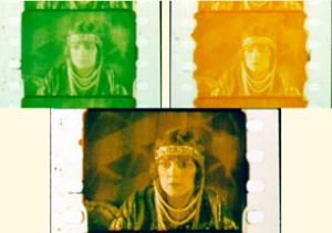

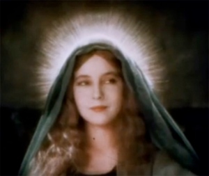
Some of the earlier subtractive color systems, namely from 1922-1926, produced some truly eye-popping moments in some of the era’s best silent films:



Leave a comment